MARSEILLE
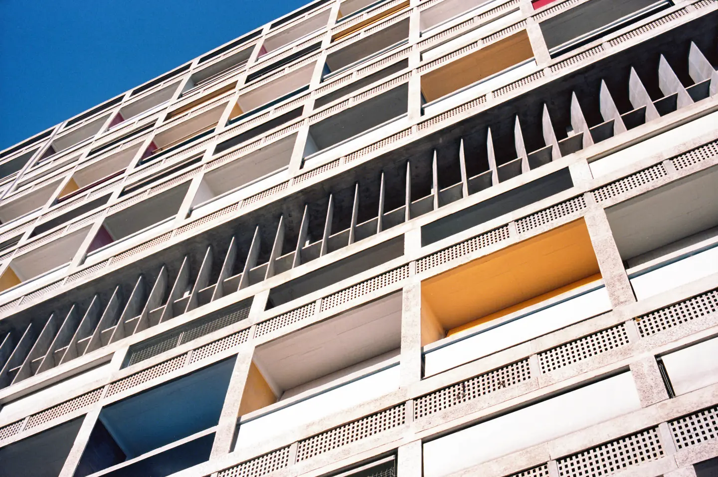
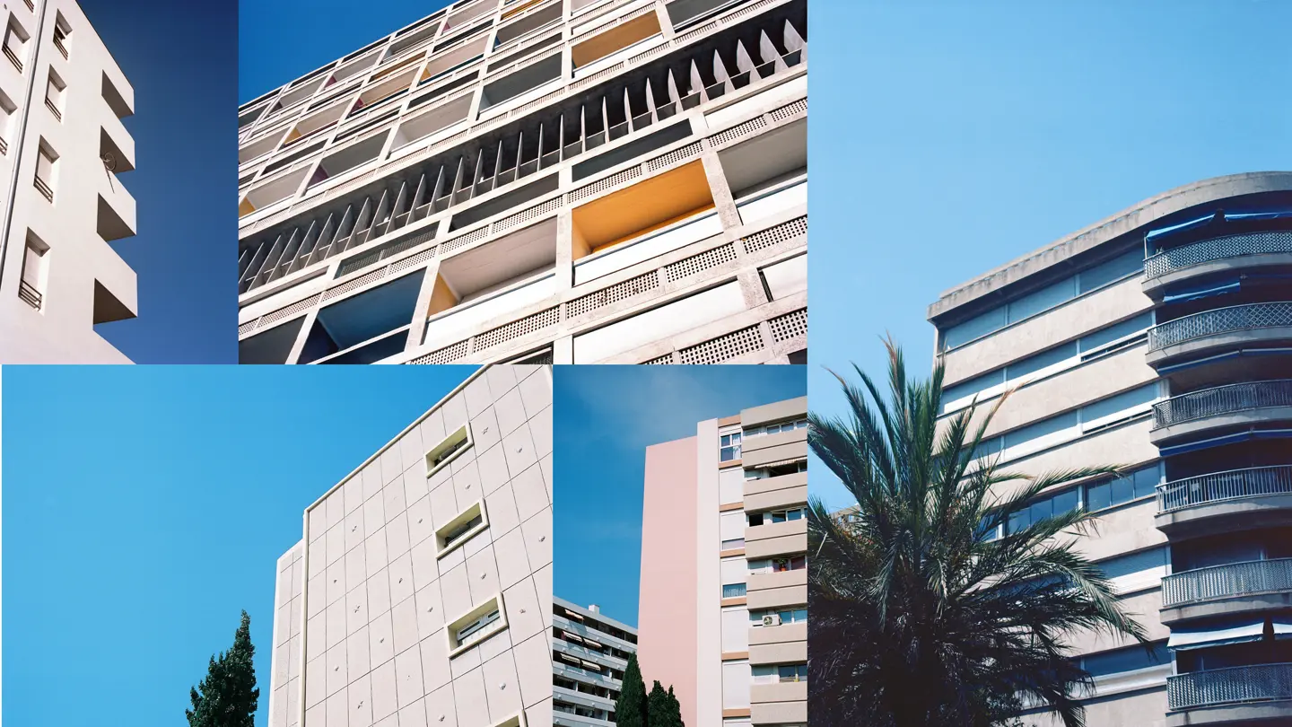
Kane Hulse is a London-based photographer, who create projects exploring colour and form through photography. Traversing the medium influenced by architecture and art, Kane composes graphic photographs documenting urban reality in cities around the world. His first two books focus on the architecture of Napoli (2013) and Havana (2015), while his latest series from Marseille was exhibited at the Leica Store UK during the Summer of 2018. Shot with the analogue Leica M6, his photos from Marseille are an ode in pink and blue to the bustling port on France’s South coast. His work captures the city’s recondite beauty within the context of modernist Mediterranean architecture. We spoke with Kane about his love of analogue photography and how he came to ditch his original plan to drink bottles of Pastis in the sun and document the Marseille Ultras after being inspired by a quote from Monet.

How did you first get into photography?
My entry into photography began technically at 18 years of age on the local art foundation course at Ravensbourne College. I was influenced by a friend, who I look up to, and began shooting rather rubbish fashion stories on disposables. Visually my path into photography began watching 60s modernist Italian cinema, which formed a need to create iconographic work.
Which photographers have influenced and inspired your style?
Luigi Ghirri is the number one for me. I came across his Kodachrome book and instantly connected to the serenity he conveys through his work. You can sense he was at home with nature, yet his architectural compositions and urban landscapes within that are what makes his work special. William Eggleston is also a big inspiration. His use of colour and composition is top level.
When did you first start shooting with Leica?
I’ve been shooting with Leica for a few years now. For me the brand represents an elegance in design that lets me shoot as I want. A lot of my work is inspired by minimalist and modernist approaches and I think Leica represents these values through their work.
Where does your interest in architectural forms and structures come from?
Growing up I’d float between boring suburban Bromley in the UK and different pockets of South London, with the latter creating a deep impression on me visually. These brutalist estates seemed enormous at the time and to wander around felt like walking through a film set. At the same time, the films I was watching, such as “Lock Stock…”, always used architecture so strongly to represent a city and this has stuck with me.
How would you describe the concept of this particular series?
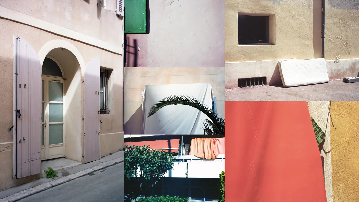
Originally the plan was to drink bottles of Pastis in the sun and document the Marseille Ultras but things turned out quite differently. Instead there’s a Monet quote from his time in Antibes, which encapsulates the series. “What I bring back from here will be sweetness itself, white, pink and blue, all enveloped in this magical air”. For me this made sense as soon as I landed in Marseille and it motivated me to convey the city’s architectural story through colour and form.

What role does colour play your compositions?
Colour is indispensable to my work. Growing up everything was very grey, architecturally, whereas cinema and books offered a sense of escapism through their colour palette. Colour creates very raw emotions, so if I see one that connects with me, I’ll look to frame the image around that and give it a platform. It could be an abandoned mattress or Le Corbusier’s Unite d’Habitacion. In Marseille you are blessed with moments of colour that the sun opens up for you like clockwork.
You shot this series with the Leica M6. How does the analogue nature of your set up influence your process and resulting photographic style?
It relaxes the process completely. Analogue photography appreciates its imperfections and is therefore a departure from the concept of a perfect image. There’s no chimping on the back screen after the shot or back at the hotel checking the angles, so you can relax and just shoot. I think we need time apart from viewing our images and analogue offers that. There’s also an element of knowing that the film could come back completely screwed, which makes the images in the final cut more special.
You also shot with a 50mm Summilux-M f/1.4 and a 28mm Summicron-M f/2 lens. How do these particular focal lengths influence your style? And what challenges do they present?
I started with the 28mm, which was perfect at capturing subjects in the tight, shadowed Marseille streets but it would capture too much at times. Especially when I wanted a clean image. So I took out the 50mm and this was the perfect lens for the work. It let me control what was in the frame and I could create the graphic compositions I wanted, while also isolating particular pieces of colour or forms that I want to elevate in the image. The different pinks that came out of that lens were unbelievable.
This series works primarily with abstract perspectives, never revealing the buildings and structures as a whole. Why is this?
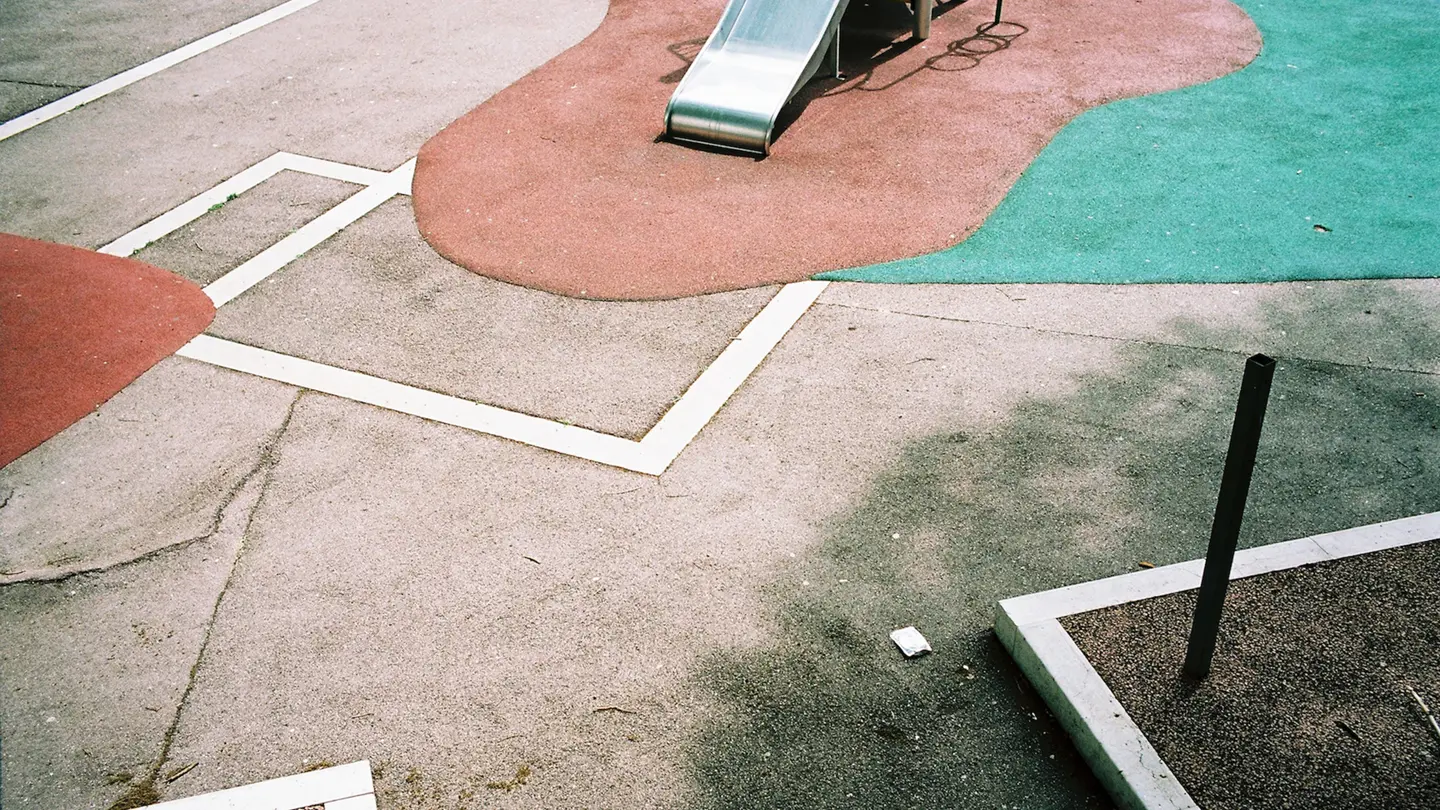
I find it restricting to document the building as a whole. Google will have that image if you look for it and it will have been done ten times over. I also like to leave an element of mystery to photos and why can a detail from a supermarket car park not be as beautiful as one from a design masterpiece such as Le Corbusier created? It offers a more democratic view on what we consider to be beautiful. I think what people take from a structure are the details that reach out to them. It could be the shape of a door handle or a shade of mint green in the sun, so these are precisely the things I feel it’s important to document.

In addition to the physical forms and colours in your compositions, you also work with strong shadows. What do you think these add to your photography?
Shadows create a sense of not knowing what is there, which when combined with abstract compositions leaves enough mystery from the viewer’s perspective. Tanazaki said “Were it not for shadows, there would be no beauty” and I find that hard to argue with.
You’ve shot series focusing on architectural forms and colours in cities across Europe. How does Marseille compare to these other cities? What makes it unique?
Like Napoli, it’s always been considered a dirty port city. Initially I found this very appealing but on arrival, and after exploring, I realised that Marseille has its unique brand of Mediterranean Modernism. That was something I had never come across before. It’s architectural identity is steeped in post-war Modernism. As the sun poetically slants across the port from dusk until dawn, it creates an incredible light on the city. You feel like you’re in the epicentre of the world.
What other projects are you working on at the moment? What can we look forward to seeing from you in the near future?
I’m working on a series of images documenting the eroding painted walls of Venice. As life unfolds, homeowners paint over their walls to cover marks or graffiti, which then creates layers of incredible colour drenched in sun and naturally eroding. The series is called Pentimento and it will be exhibited at Paul Smith’s Mayfair store in London next February.